2 Types of Landing Pages That SaaS Startups Absolutely Need
Summary
Most SaaS websites underperform by using a single, generic pitch that fails to capture visitors with different buying intents.
To fix this, create two distinct landing page types: deep-dive "vertical slice" pages for specific features and broad "horizontal slice" pages for industry or use-case solutions.
Start by building 3-5 vertical pages for your sharpest capabilities and 3 horizontal pages for your best customer profiles to immediately improve conversion.
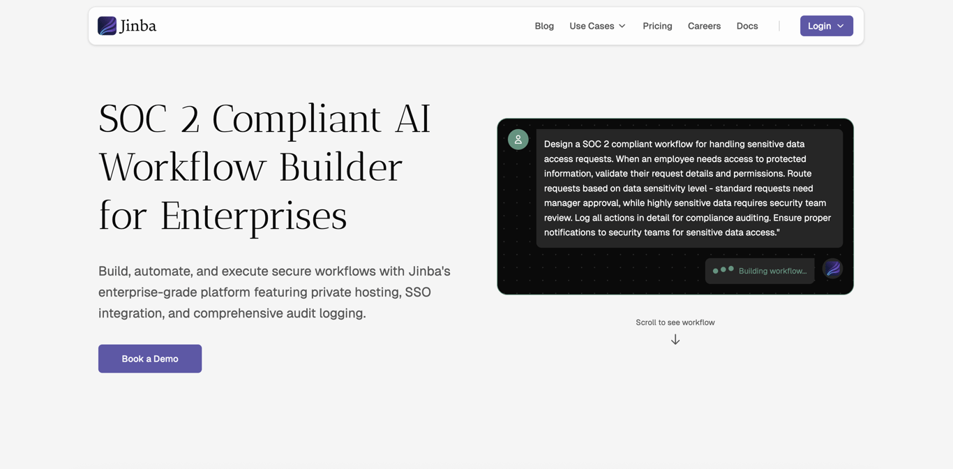
Synscribe's SEO & Content Strategy helps build these high-converting landing pages to turn your website into a customer discovery engine.
Your SaaS website might be the most expensive brochure you've ever built.
You've got a clean hero section, a feature grid, a pricing page, maybe a blog. It looks like a real product website. But if you're honest about your traffic-to-trial conversion rate, something isn't adding up. Visitors land, glance around, and leave — no signup, no demo request, no reply.
Here's the frustrating part: it's usually not your product that's failing them. It's your information architecture.
Most SaaS startup websites fail for a deceptively simple reason — they explain the product in only one way. One homepage. One features page. One generic pitch. But your buyers don't discover you in one way, and they certainly don't arrive with the same intent.
Some of them show up with laser-focus: "train chatbot on SharePoint documents." They know exactly what they need. They're scanning for a vendor who clearly, demonstrably gets it. Others show up with a messier situation: "we need an AI workflow tool, but we're SOC 2 compliant and can't risk it." They're assembling requirements, not matching keywords. They need a coherent story, not a feature bullet point.
Your site has to catch both types of visitors — or you're handing those conversions to a competitor who does.
The fix is more structural than it is creative. It comes down to building two specific types of landing pages: vertical slice pages and horizontal slice pages. Get both right, and your website stops being a business card and starts working like a 24/7 discovery engine.
The Mental Model: Vertical vs. Horizontal Slices
Before diving into tactics, it helps to get the mental model right — because these two page types are genuinely different in how they think, how they read, and who they convert.
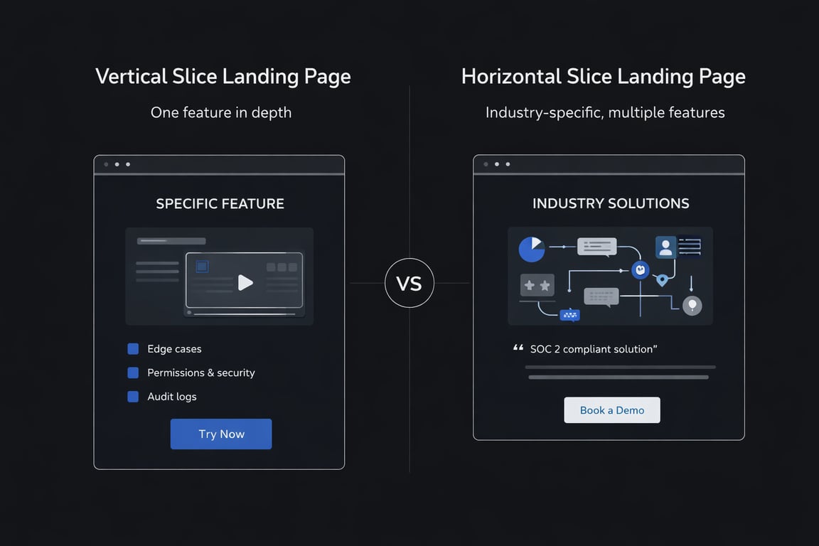 A vertical slice page goes deep on one standout capability. It's a scalpel — one job, one outcome, one very specific promise supported by real, substantial detail. The visitor arriving on a vertical page is already "solution-aware." They know what they want. Your job is to prove you do it better than anyone else. Think of it less like a marketing page and more like a very confident answer to a very specific question.
A horizontal slice page goes wide across multiple features to tell a story tailored to a particular context — an industry, a use case, a team type, or a workflow stage. It's a map, not a scalpel. The visitor here is still piecing together what they need. They're asking: "Does this product fit my whole situation?" Your job is to bundle your capabilities into a coherent narrative that reflects their reality.
Here's the line worth remembering:
Feature pages sell depth. Solution pages sell fit. You need both.
They serve different intents. They trigger different emotions. They lead to different conversion actions. A vertical page typically ends in a self-serve signup, a feature walkthrough request, or a deeper dive into your docs. A horizontal page typically ends in a demo booking or a sales conversation.
Neither page type is better. They win different battles.
Vertical Slice Pages Win on Depth
When someone searches for something hyper-specific and lands on a vague, generic features page, you've lost them. They were already close to buying. They just needed confirmation that your product specifically handles their specific scenario. Without a vertical slice page, you lose those buyers to:
Incumbents with brand credibility
Competitors who happened to build one great, focused page
"Good enough" tools that look like a better match, even if they aren't
Horizontal Slice Pages Win on Fit
When a prospect is mid-evaluation — comparing tools, talking to their team, building an internal case — they need to see how your product fits their world, not just their feature checklist. Without horizontal pages, you lose those buyers to:
"Platform" competitors who look more complete and mature
Agencies or consultants who frame the problem more compellingly
The dreaded default choice: "Let's just stick with what we have."
Type #1: Vertical Slice Landing Pages (Feature / Capability Pages)
What a Vertical Slice Page Actually Is
Let's clear up a common misconception first. A vertical slice page is not a generic feature list page. It's not the page where you bullet out "AI-powered, 50+ integrations, real-time dashboards." That's a features overview — and it's a conversion black hole for high-intent visitors.
A true vertical slice page is one focused promise, backed by the kind of real detail that makes a technical buyer stop scrolling and think: "These people clearly understand this problem."
Think of it in three layers:
Micro-capabilities (the building blocks of a feature)
→ roll up into one core feature
→ which earns its own dedicated landing page
Each page is a standalone answer to one precise searcher intent. It doesn't try to tell your whole brand story. It exists to win one query and convert one type of buyer.
What to Actually Put on a Vertical Slice Page
Your central question when building this page should be: "Could this work for me, in my specific environment?"
That's what your visitor is asking. Answer it completely.
1. Who it's for + the exact problem Use the language of the search query, not your internal product vocabulary. If they searched for "audit log for Slack messages," that phrase should appear prominently on your page, not buried in paragraph four.
2. How it works A clear, step-by-step flow. Screenshots are good. Short video clips are better. Ambiguity kills conversion on these pages because your visitor is technical and evaluating closely.
3. Depth sections (this is where most startups underperform)
This is the section your competitors skip — and it's where you can build a decisive advantage. Go deep on:
Edge cases and constraints (what happens at scale? what are the limits?)
Permissions and security considerations
Setup requirements and prerequisites
Fallbacks ("what happens when it fails?")
Most SaaS pages stop at the happy path. Buyers — especially in B2B — have been burned before. They want to know what happens when things go wrong.
4. Proof A metric, a customer quote, a short demo clip, or a concrete before/after example. Keep it relevant to the specific capability on this page, not a generic "our customers love us" testimonial.
5. CTA: "See it," "Try it," or "Get a walkthrough" These convert better than "Get started" for high-intent visitors because they feel lower-risk and more specific.
What Vertical Slice Keywords Look Like
 These are usually shaped like a formula: verb + object + constraint.
"export linkedin commenter" → Apify Linkedin Comment Scraper
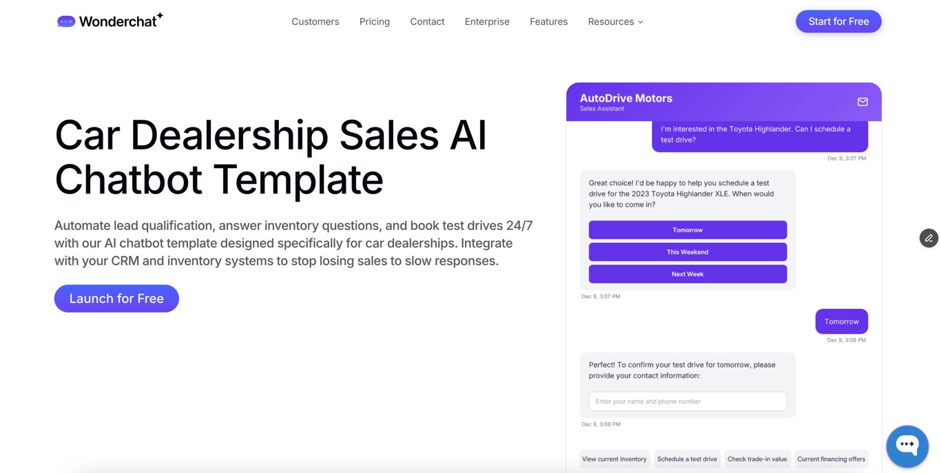
"car dealership ai chatbot" → Wonderchat's example page is a strong execution of this
Other patterns you'll see across SaaS verticals:
"sync [System A] to [System B]"
"generate [artifact] from [input]"
"auto-route [work item] based on [rule]"
"detect [event] in real-time"
"redact [sensitive data] automatically"
"audit log for [action or platform]"
When you win these queries, you're winning buyers who are already past the awareness stage. They're not researching whether they need a solution — they're deciding who to trust with it.
The Founder Move Most Teams Skip: Video → Vertical Pages
Here's an underused advantage available to almost every early-stage SaaS team: your existing product videos are raw material for vertical slice pages.
Think about it. A Loom walkthrough you recorded for a customer onboarding call. A webinar segment where you demonstrated one specific workflow. A product demo clip from your last sales call. These are already structured demonstrations of a single capability. They already contain the "how it works" proof that vertical pages need most.
Most of your competitors are writing vague, aspirational feature copy. You can show — literally show — exactly how it works.
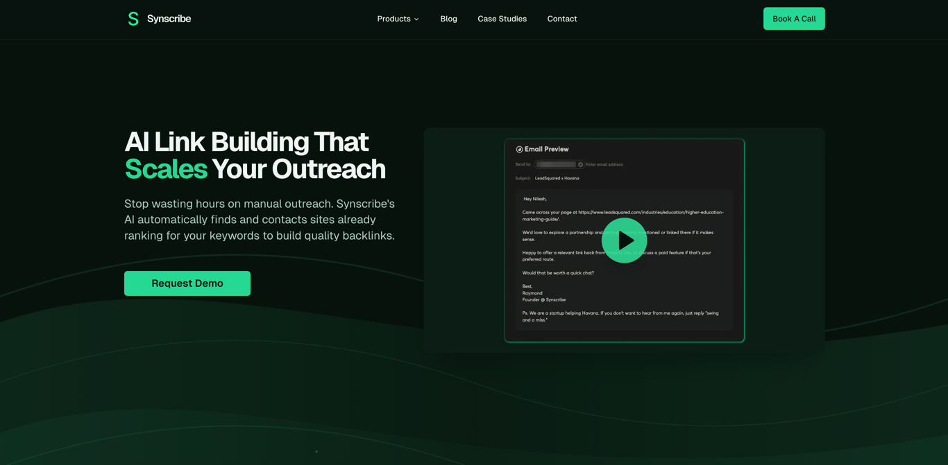 Synscribe's own feature page is a clean example of this format done well: lead with the promise, show the workflow, include the depth, close with a specific CTA.
If you're sitting on five Looms and two recorded webinars, you already have raw material for 10 to 20 strong vertical slice pages. The content exists. It just needs the right structure around it.
Type #2: Horizontal Slice Landing Pages (Solution / Use-Case / Industry Pages)
What Horizontal Slice Pages Actually Do
If vertical pages are surgical, horizontal pages are architectural. They don't zoom in on one capability — they zoom out to show how your product maps to an entire situation.
A horizontal slice page answers a fundamentally different question: "Does this product solve my whole situation, not just one feature?"
The buyer arriving here is context-driven. They might be a Head of Operations at a healthcare startup. They're not searching for a single function — they're searching for evidence that your product understands their world: their compliance requirements, their team structure, their existing stack, their reporting needs. One feature bullet won't close them. A coherent story might.
These pages typically include:
The persona and context — who this is for, stated clearly upfront
A workflow narrative — walking through the journey from intake → action → reporting (or whichever arc applies to your category)
A "what you get" section — capabilities, integrations, compliance coverage, support model
Social proof relevant to that segment — ideally a customer from that same industry or team type
A strong "Book a Demo" CTA — because these buyers need a conversation, not a free trial
What Horizontal Slice Keywords Look Like
 These are shaped like: category + context.
"AI sales coach for automotive dealerships"
"workflow automation for finance ops"
"knowledge base for distributed startups"
"security monitoring for SOC 2 teams"
Notice what's happening in these searches. The user isn't asking for a feature. They're asking for a package — one that fits their industry, their team, their constraints. They want a vendor who has thought about their situation specifically, not one who happens to have a relevant feature buried in a generic product page.
That specificity is exactly what horizontal pages deliver.
Why Horizontal Pages Are Especially Powerful in Competitive Markets
Early-stage SaaS founders often feel like they can't compete with incumbents on credibility or feature breadth. That's fair — but horizontal pages create an opening.
A large, established vendor builds for everyone. Their messaging is necessarily generic. Your horizontal page can be written exclusively for a Series B healthcare startup with 12 ops people and a SOC 2 requirement. No large vendor can replicate that specificity without diluting their broader positioning.
This is the challenger's advantage: fit beats breadth when the buyer is the right fit.
When a prospect sees a page that feels like it was written for them — their job title, their industry, their specific workflow pain — the credibility gap closes fast. They stop asking "is this product sophisticated enough?" and start asking "when can we start?"
How These Two Page Types Should Work Together
Building both page types in isolation misses the real leverage. The goal is to connect them into a loop — so that no matter which type of page a visitor lands on first, they can travel deeper into your site rather than bouncing.
Here's how the architecture should flow:
Horizontal page wins "fit" traffic → links to relevant vertical pages for depth
Vertical pages win specific-intent traffic → links back to horizontal pages for broader story and demo path
A simple rule to wire this up:
Horizontal → Vertical: "See exactly how [feature] works →"
Vertical → Horizontal: "Used by [industry] teams for [use case] →"
This structure prevents the two most common website failure modes:
All high-level fluff (lots of narrative, no mechanism — visitors don't believe you)
All feature fragments (lots of capability detail, no story — visitors can't see themselves in it)
Treat your internal links like product packaging. Every connection between pages is an opportunity to either deepen trust or broaden relevance. Used well, this loop turns your site into a se1lf-guided evaluation journey.
Putting It All Together
Let's make this concrete with a hypothetical company: an AI sales coach like Hyperbound that helps reps improve their performance on live calls.
Their product has several powerful capabilities (verticals) and serves multiple types of sales teams (horizontals).
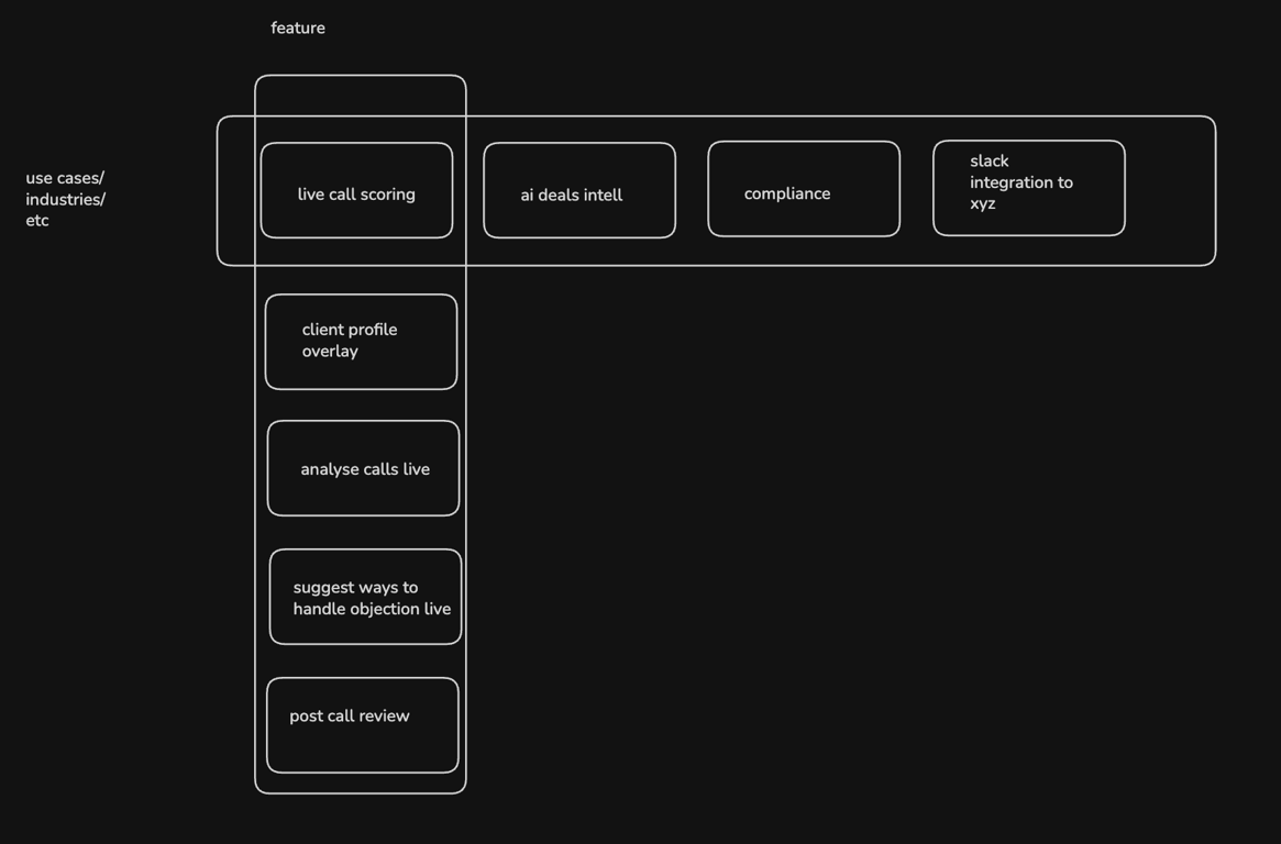
Horizontal Slice (Solution for an Industry): A page titled "AI Sales Coach for Automotive Dealerships." This page wouldn't just list features. It would tell a story about the unique challenges of car sales—handling walk-ins, managing financing objections, and dealing with trade-in negotiations. It would bundle features like
live call scoring,compliance, andintegrationsinto a narrative that a dealership manager would immediately recognize. The goal is to prove fit.Vertical Slice (Deep-Dive on a Feature): A page titled "Live Objection Handling Suggestions." This page would go incredibly deep on just one thing. It would show how the AI analyzes conversational patterns in real-time to identify a prospect's objection (e.g., "price is too high," "need to talk to my partner"). It would include screenshots of the UI overlay, explain the underlying language models, and detail how to customize suggestions for different sales playbooks. The goal is to prove depth.
A prospect from a car dealership might land on the horizontal page first, see that the tool understands their world, and then click through to the vertical page to understand exactly how the objection handling works. Another prospect might search directly for "live sales objection AI" and land on the vertical page, then navigate up to the horizontal page to confirm it works for their industry.
Both paths lead to a conversion because the site architecture is built to handle both types of intent.
The Founder Checklist: What to Build First
If you're resource-constrained (and most early-stage founders are), here's the sequence that delivers the fastest return.
Step 1 — Build 5 Vertical Pages: Your Sharpest Wedges
Pick the 3 to 5 capabilities that can independently win a searcher. Specifically:
The thing that feels unfair when a prospect sees it — the "wait, it does that?" moment
The thing incumbents handle poorly or ignore entirely
The thing buyers ask about in the first five minutes of every demo call
These become your first five vertical slice pages. Each one should be strong enough to stand alone as a conversion surface.
Step 2 — Build 3 Horizontal Pages: Your Best ICP Contexts
Pick one of each:
1 industry you're already winning — where you have logos, stories, and genuine domain understanding
1 use case you're best at — the workflow or outcome you can describe more precisely than any competitor
1 team or persona that buys fastest — whoever has the budget, the urgency, and the shortest sales cycle
These become your first three horizontal slice pages. Write them as if you're pitching your best existing customer's clone.
Step 3 — Connect Them
Wire up the internal links. Every horizontal page should surface two or three relevant vertical pages. Every vertical page should point back to the horizontal context it lives inside. That's the full loop.
Build a Discovery Engine, Not a Business Card
Most SaaS websites are built like brochures. They're designed to present a company, not to intercept a buyer mid-search with exactly the right answer, at exactly the right level of depth.
But buyers don't browse brochures. They search for answers. They arrive with specific questions and specific anxieties. Your site architecture either catches them where they land — or it doesn't.
The two-page-type model is the structural fix:
Vertical slice pages prove you go deep on one capability — enough that a high-intent buyer trusts you with the job
Horizontal slice pages prove the product fits a real-world situation — enough that an evaluating buyer can see their own context in your story
Do both, and your site stops being static collateral. It becomes a system that works across the full spectrum of buyer intent — from the sharp searcher who knows exactly what they want, to the deliberate evaluator still assembling the picture.
That's how early-stage SaaS companies punch above their weight online. Not by outspending incumbents on ads or brand. But by outbuilding them on specificity — one well-crafted page at a time.
Frequently Asked Questions
What are vertical and horizontal slice landing pages?
Vertical and horizontal slice pages are two distinct types of landing pages designed to capture different buyer intents. A vertical slice page focuses in-depth on a single feature or capability to attract solution-aware buyers, while a horizontal slice page provides a broad overview of how multiple features solve a problem for a specific industry, team, or use case to demonstrate product fit.
When should I create a vertical slice page versus a horizontal one?
You should create a vertical slice page when you want to target a user searching for a very specific function, like "train chatbot on SharePoint documents." Create a horizontal slice page when you want to appeal to a user evaluating a complete solution for their specific context, such as "AI sales coach for automotive dealerships." Vertical pages sell depth, while horizontal pages sell fit.
Why is a vertical slice page better than a single 'Features' page?
A vertical slice page is better than a generic features page because it directly answers a high-intent search query with focused, detailed information. Visitors looking for a specific capability are often close to buying and will convert at a higher rate on a page that proves you understand their exact problem, rather than a page that lists dozens of unrelated features.
How do horizontal slice pages help new SaaS companies compete?
Horizontal slice pages help new companies compete by creating a highly specific narrative that larger, more established competitors cannot easily replicate. While incumbents must maintain generic messaging for a broad audience, a startup can create a page that speaks directly to a niche audience (e.g., "workflow automation for Series B fintech startups"), making the product feel like a perfect fit and closing the credibility gap.
How many vertical and horizontal pages should I build first?
To start, you should focus on building 5 vertical slice pages and 3 horizontal slice pages. For your vertical pages, choose the 3-5 capabilities that are your sharpest competitive advantages. For your horizontal pages, focus on one key industry you serve well, one core use case you excel at, and one persona that buys the fastest.
What is the main difference in the Call to Action (CTA) for each page type?
The main difference is that CTAs on vertical pages should be specific and low-risk, such as "See it in action" or "Try this feature," as they target users ready to evaluate a capability. CTAs on horizontal pages should guide users toward a broader conversation, like "Book a Demo" or "Talk to Sales," because these visitors are evaluating the product's overall fit for their situation.
Start with your next five demo call themes. They're almost certainly vertical slice page titles in disguise.
Dominate ChatGPT and Google Search
Synscribe helps B2B companies with SEO & GEO using programmatic SEO approach. Book a call to find out how we help you win.